Disclaimer: Miele Guide. This site provides fashion and lifestyle content for informational purposes only.
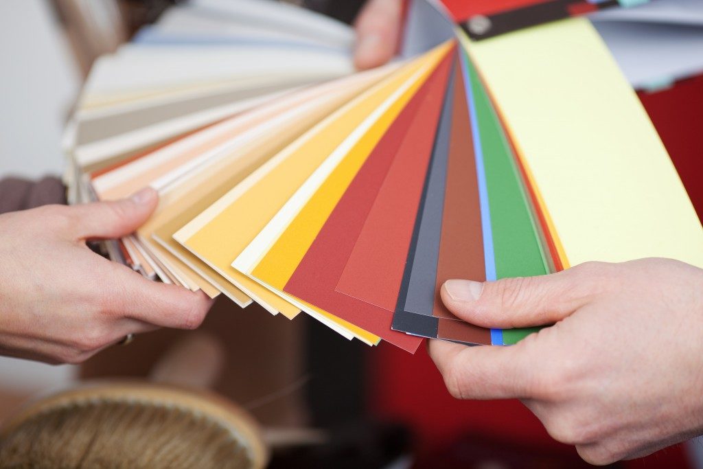
Colors play a big role in home interior design. They add an aesthetic flair to rooms. They can highlight certain areas, and at the same time, downplay the eyesores. They also influence the vibe of the room; that is why you use calming greens and blues in the bedroom and energizing reds and oranges in kitchens and living rooms.
Since they do a lot to your design, you have to be extra careful in deciding which and how to use them. One mistake, and you might ruin the visual appeal and the overall atmosphere in the space. The good news is that you can take out the hassle in arranging colors in your space by knowing this timeless 60-30-10 rule.
What the Rule Says
The 60-30-10 guideline simply illustrates the distribution of hues in the space. The dominant color covers 60% of the room. For instance, this can include the walls, large pieces of furniture like the sofa or the coffee table, and floors. The principle is that this dominant hue anchors the space and provides a backdrop or a foundation for the other shades to be used.
The 30% of the space, on the other hand, will have the secondary color. This includes most of your furnishings, linens or rugs, and treatments on windows. Salt Lake City-based designers explain that this secondary color complements the main one, but is distinct enough to add visual interest.
The last portion, the 10% of the room, should have the accent shade. In the living room, this covers the throw pillows, art pieces, and decorative stuff like vases and jars. In the bedroom, this includes the accent pillows, candles, and lamps. When you pull off the 60-30-10 rule, you will have a balanced-looking design.
How to Break the Rule

As you know, interior design is not all about following the rules. Once you get to know the principles, you can play with them. Bend them, even.
For instance, you can go 110%. You stick to the 60% dominant, 30% secondary, but add two 10% accents. Sometimes a space really needs more than one accent color to make it more visually interesting. If that is the case in your home, go ahead and add that bright orange abstract painting.
You can also choose monochromatic. In the traditional rule, you get different, distinct hues. In this case, you are only getting one color, but in three different shades. The dominant offers a neutral mood, the secondary has a deep tone, and the accent reflects a lighter mood.
This version of the 60-30-10 rule is perfect for minimalist-style homes, as it contributes to that whole neat, subdued vibe. Do note though that this is a bit tricky to pull off, so if you can consult an interior designer, better.
Remember, one mistake in your color choice can ruin the entire look and feel of your space. So take note of the timeless 60-30-10 rule. Once you get the hang of it, try your hand at spinning a new version of it. Give it your own flair.